
Wallstreet.io
A precise visual system for trading tools and insights.
After years of serving a loyal community of traders and investors, Wallstreet.io had evolved far beyond its original backtesting roots. Its technology, audience and product offering had grown, and the brand needed to evolve with them.
We created a bold, confident identity that retained the platform’s technical credibility while making it more accessible and human. A vivid neon green, contrasted against deep black and pure white, creates a distinctive visual presence with instant recognition across digital and physical applications.
At the heart of the identity is a custom logo mark inspired by upward candlestick movement and momentum, a simple visual expression of growth, progress and informed decision-making.
The wider design system combines modular geometry, sharp gradients and clean typography to communicate movement, precision and logic. Helvetica Bold and Regular provide a clear typographic foundation, keeping information highly legible across even the most data-heavy applications.
The identity extends seamlessly across trading dashboards, mobile interfaces, data visualisations, social content, investor materials, merchandise and signage, creating a consistent brand experience at every touchpoint.
The result is a more mature and distinctive Wallstreet.io, one that stays true to its technical roots while opening the door to a broader community of traders and investors. Bold where it needs to be, human where it matters, and built to support the platform’s next stage of growth.




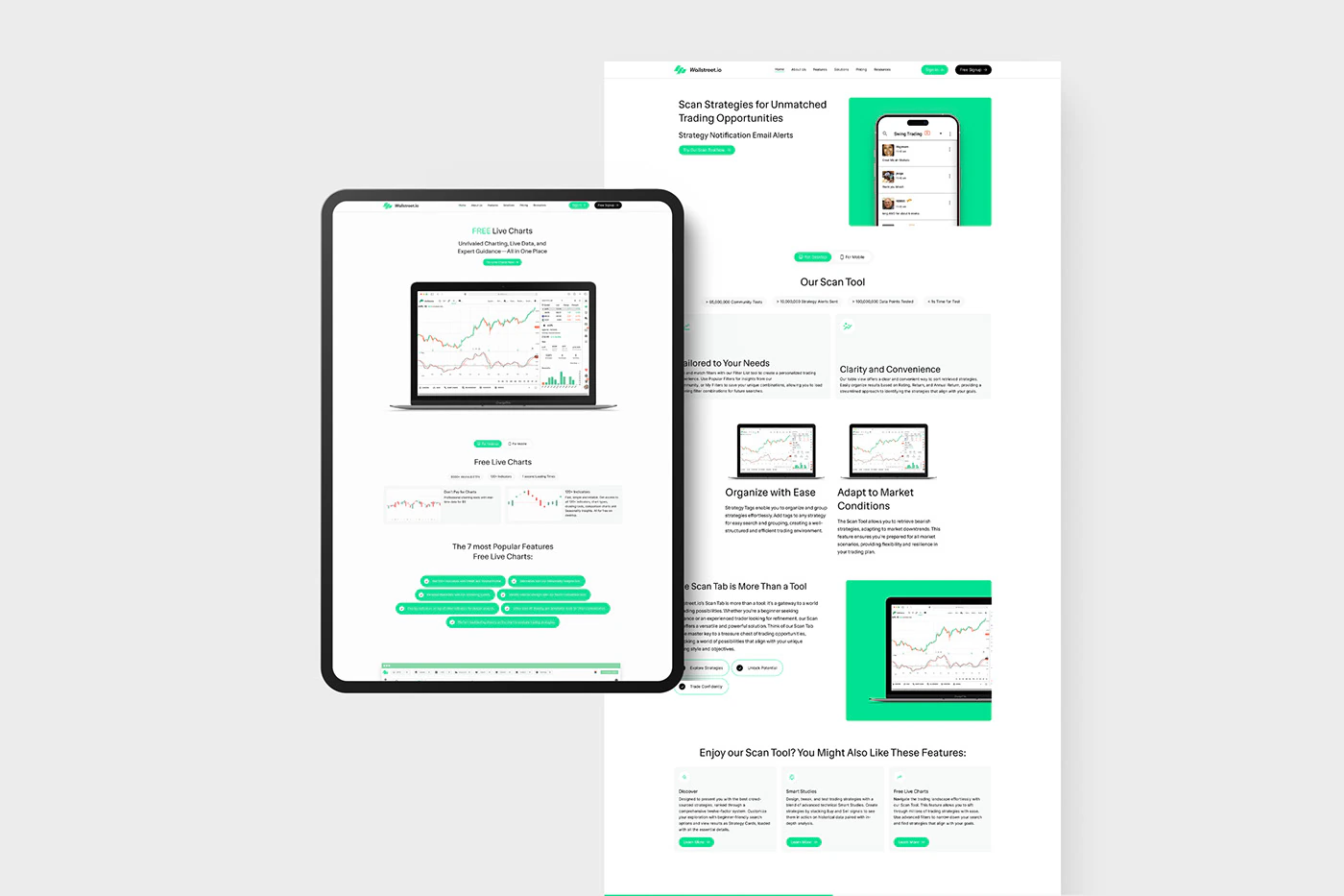
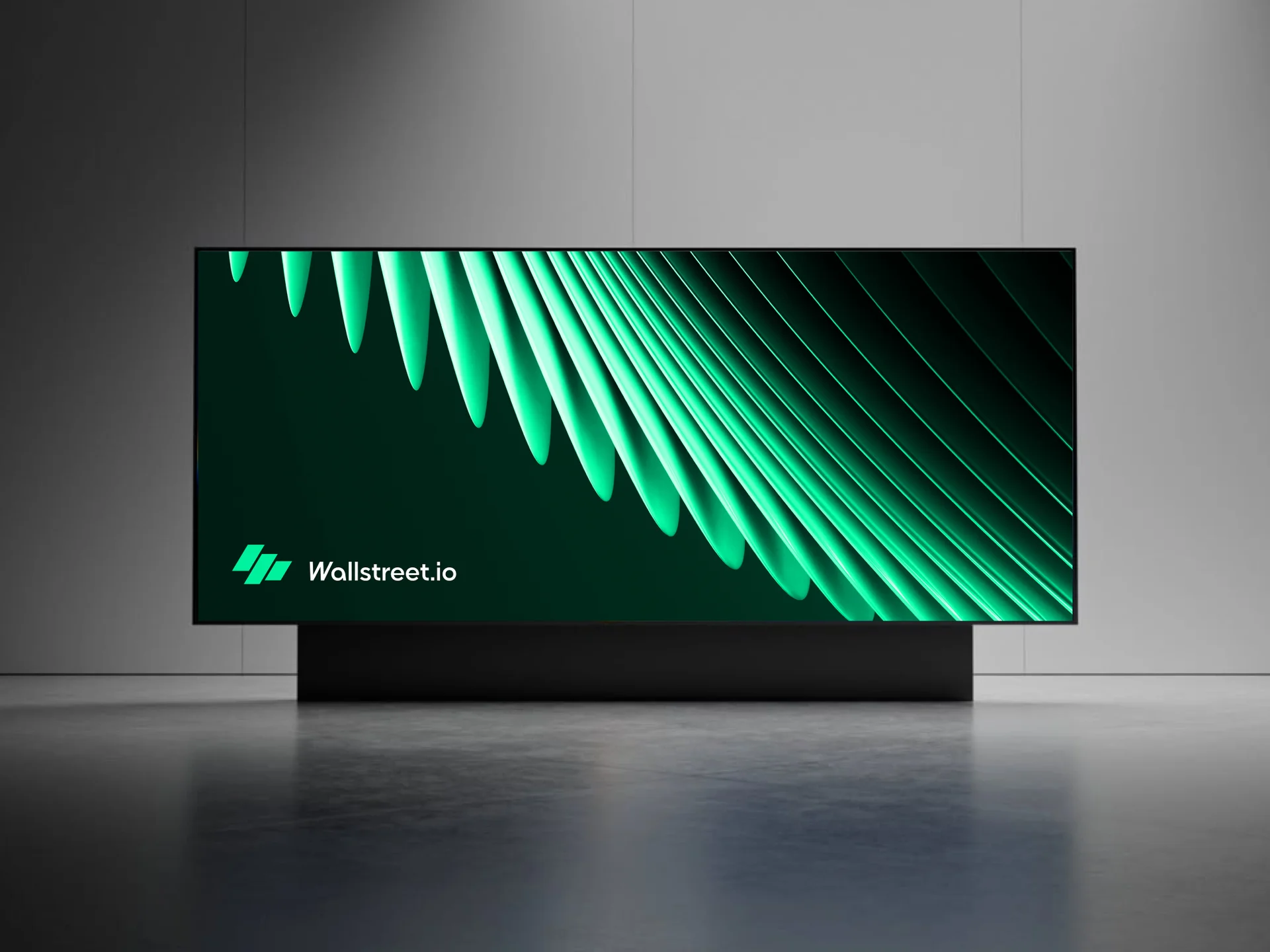


The work in context
The visual language extends across dashboards, mobile screens and investor presentations.