
Bivial
Swiss precision, made useful for a global digital business.
Bivial (formerly Klarpay) is a modern Swiss financial company offering multi-currency IBAN accounts and international payment solutions for digital-first businesses. Built on the foundations of Swiss precision and security, Bivial empowers global entrepreneurs, startups and enterprises with reliable cross-border financial services and seamless digital infrastructure.
Our brand identity was created to reflect Bivial’s precision, trustworthiness and forward-thinking approach. At its heart is a custom symbol inspired by the Swiss cross, softened and rounded to create a distinctive mark that balances national heritage with a modern, digital-first character.
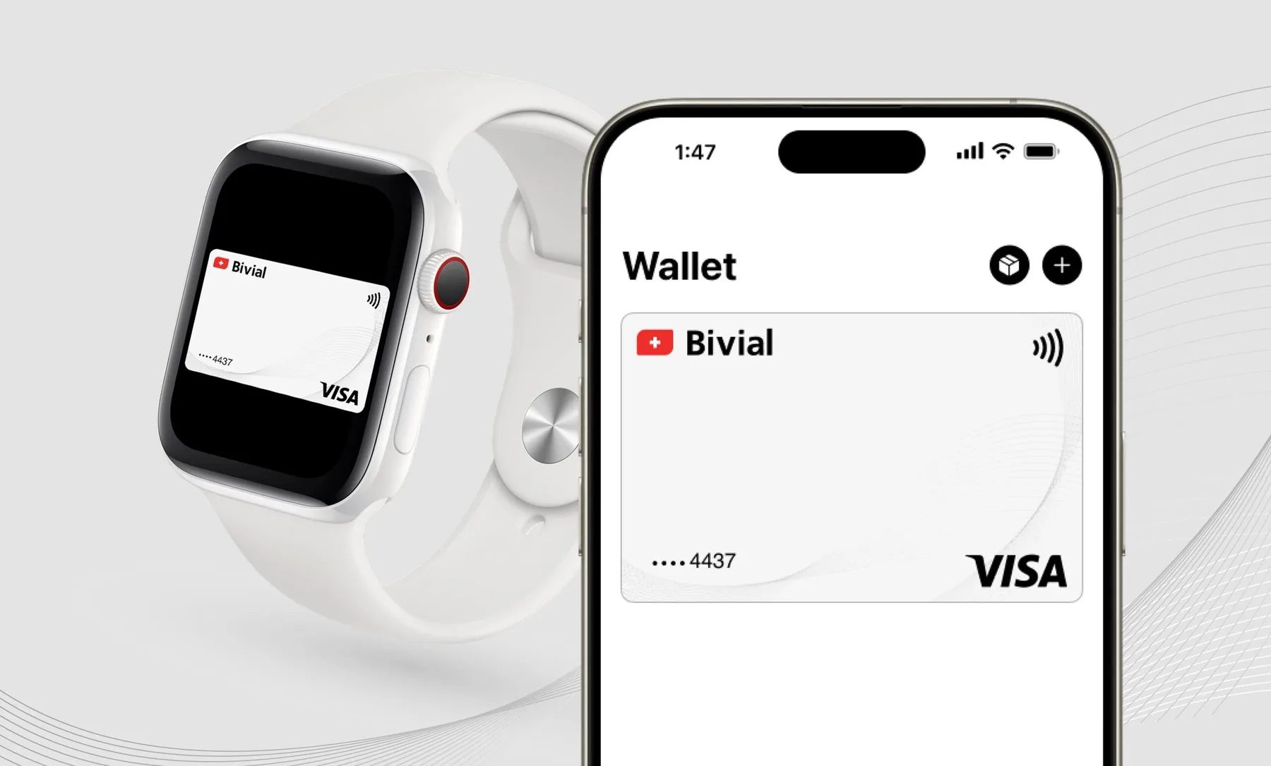
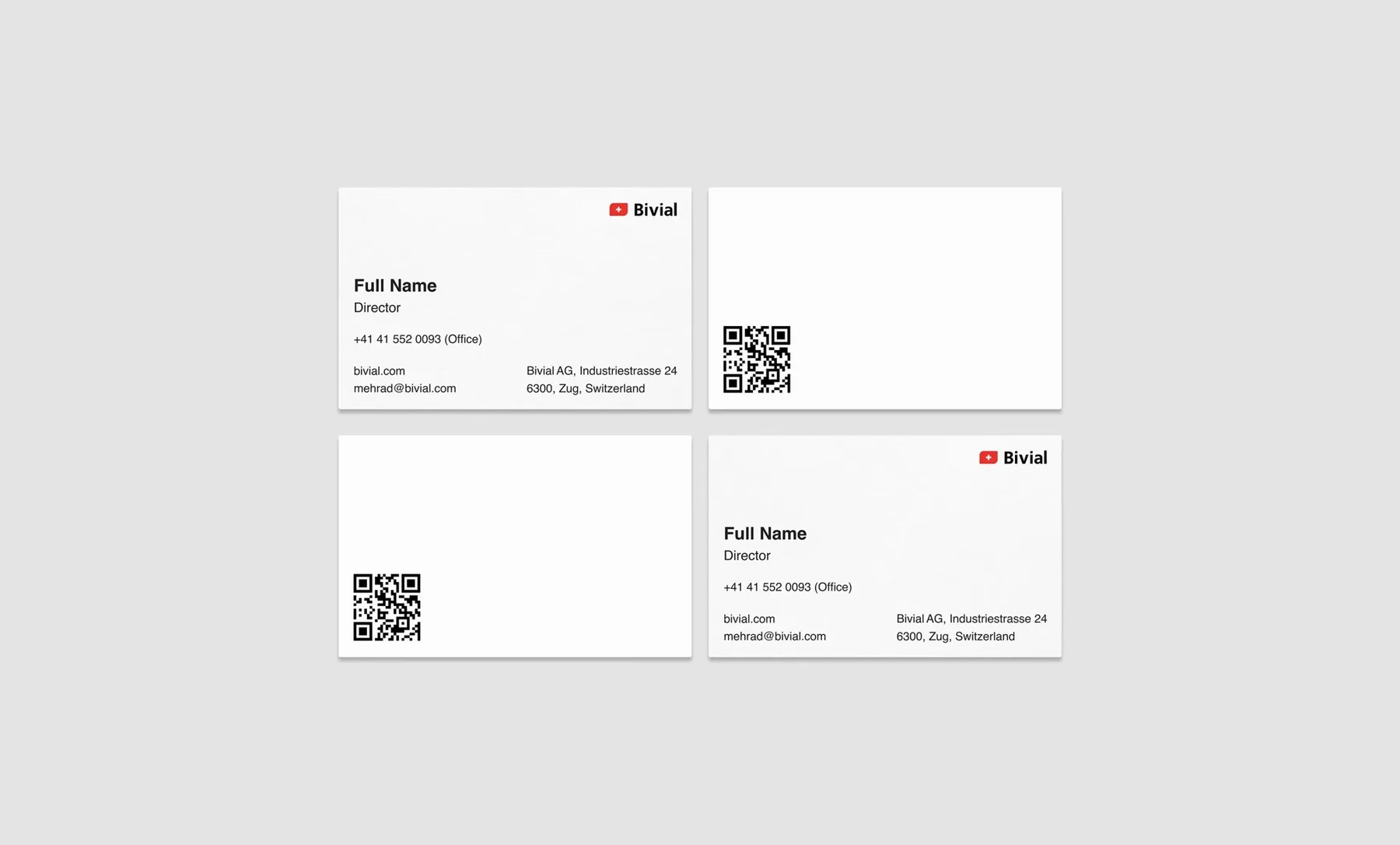
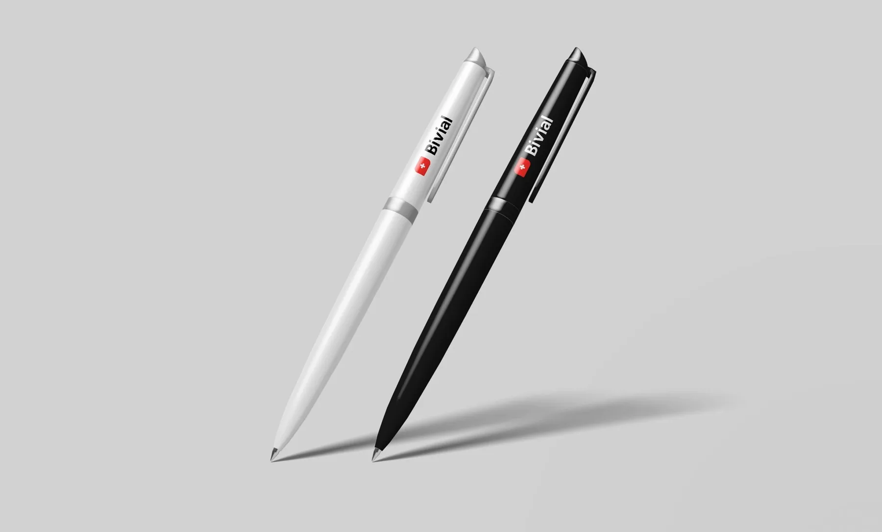
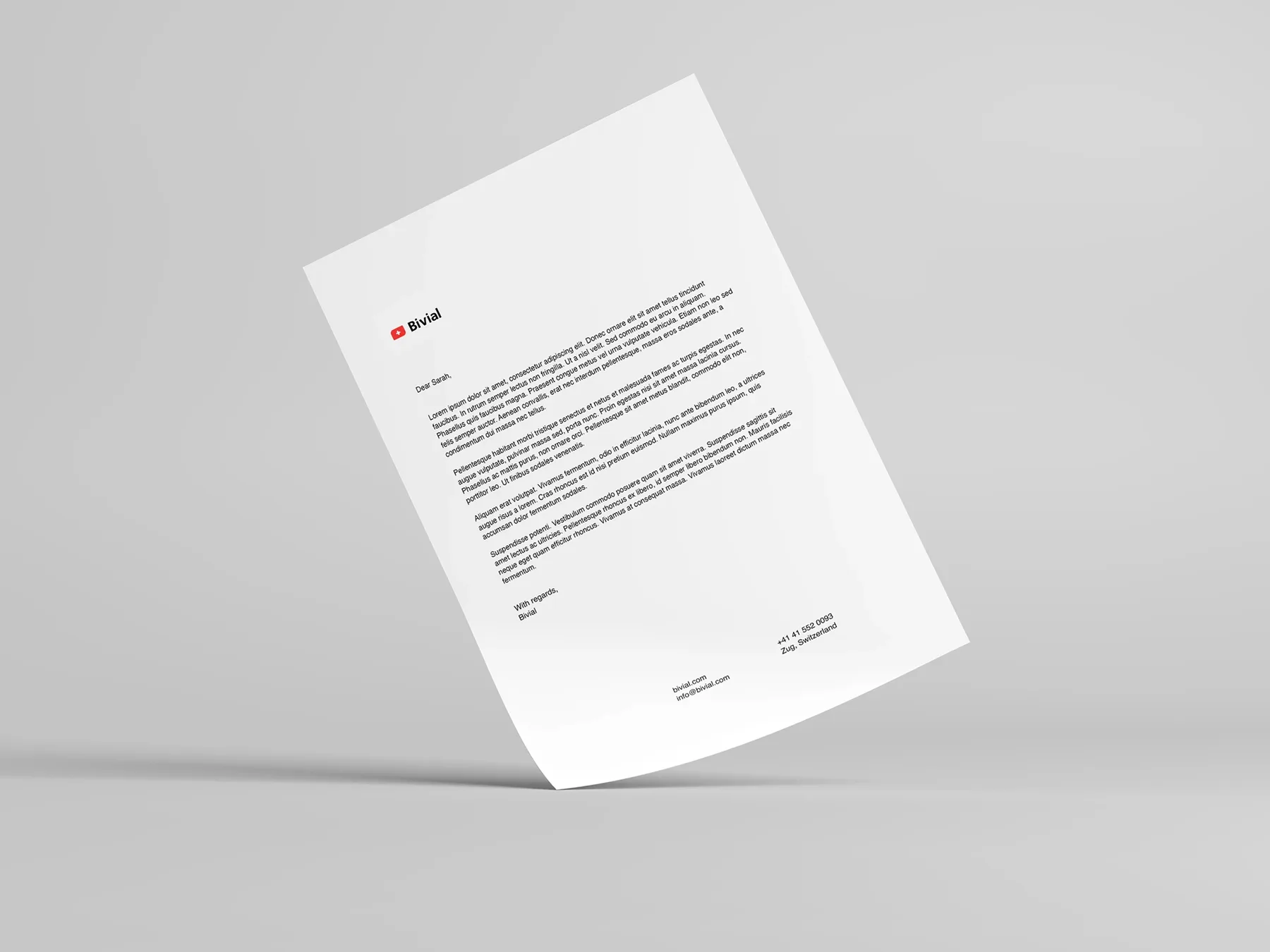
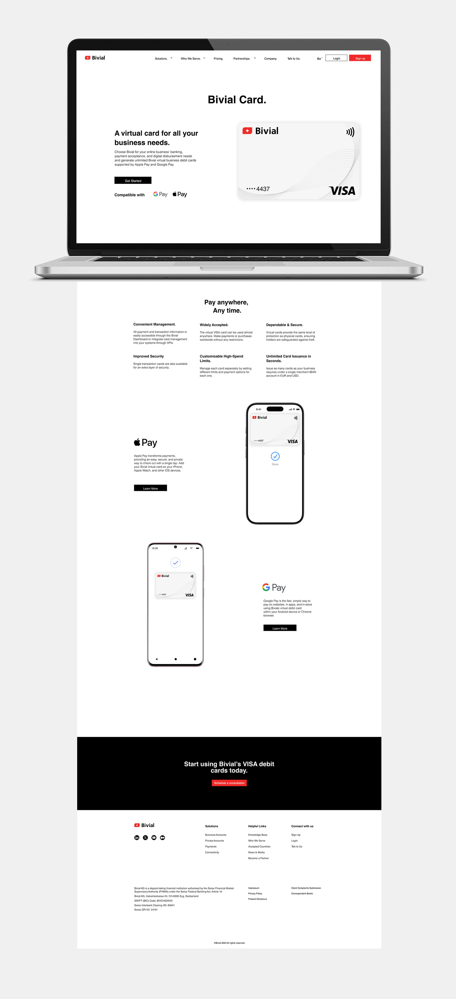
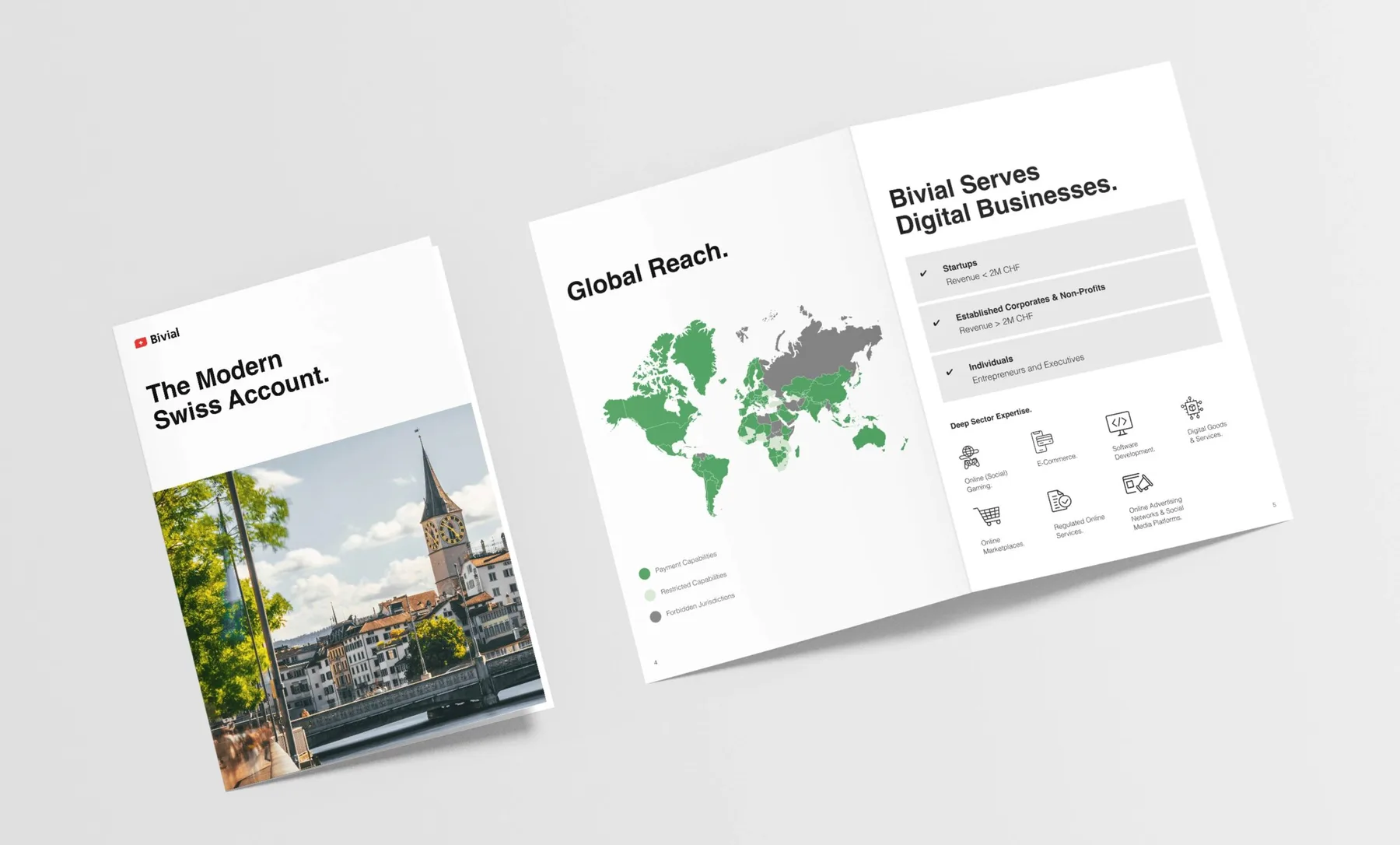
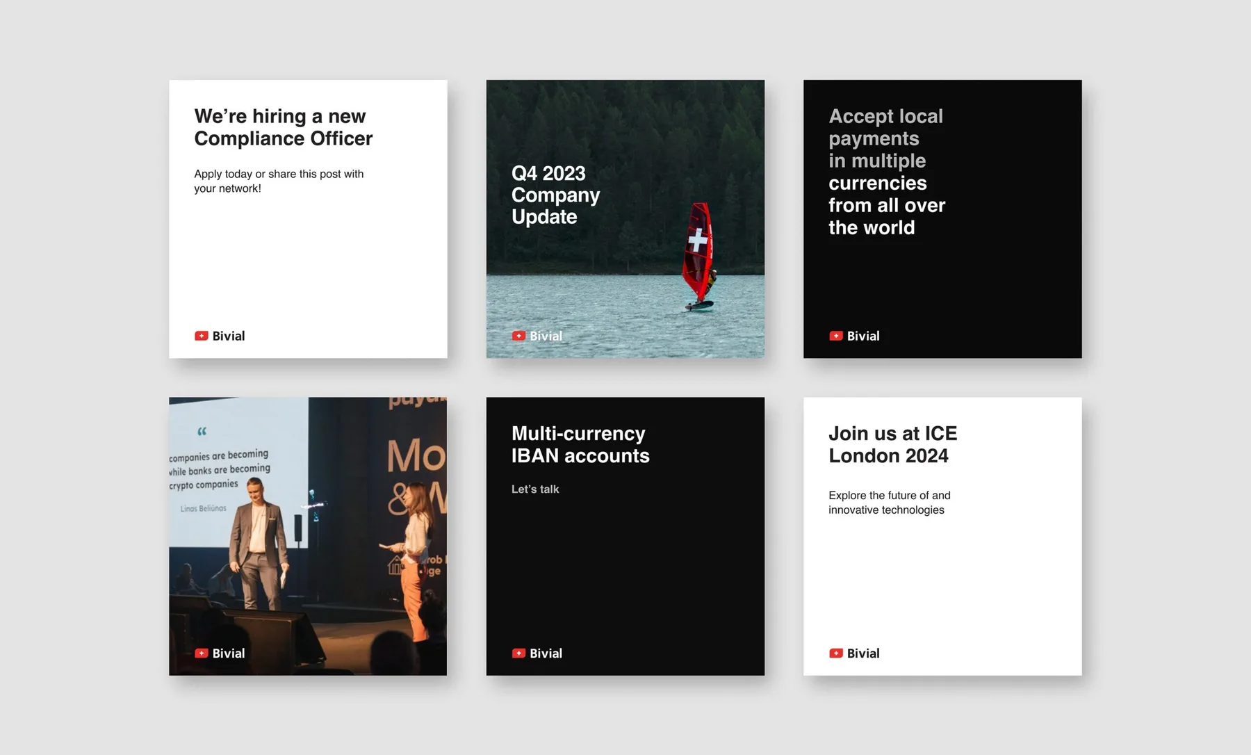
We developed a bold visual system around a high-contrast palette of black, white and Swiss red, paired with clean typography and structured layouts. The identity was designed to work consistently across every touchpoint, from the digital platform and debit cards to social media, business stationery and beyond.
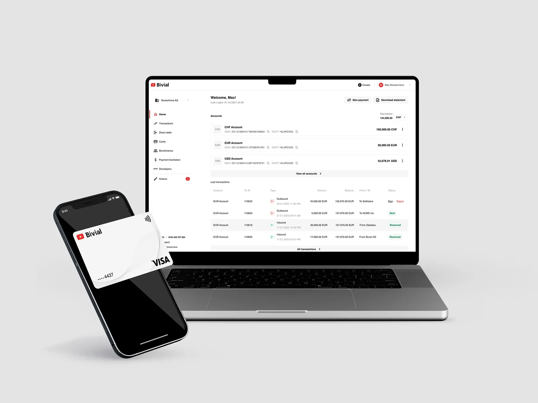
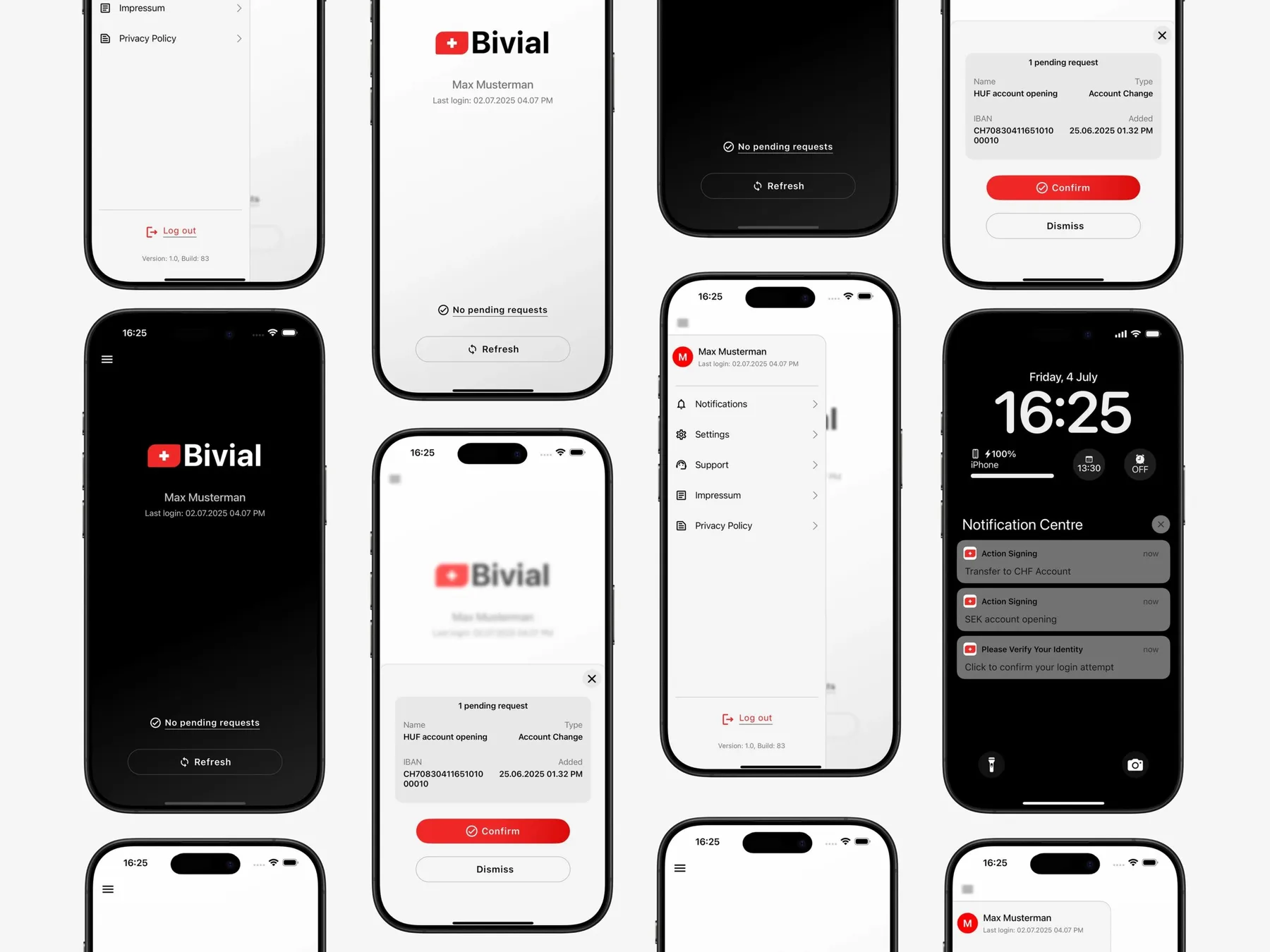
From the logo mark to the banking dashboard, every element of Bivial’s identity is grounded in clarity, usability, scalability and trust. The result is a cohesive and confident financial brand designed for a global audience, built in Switzerland, made for the world.






The work in context
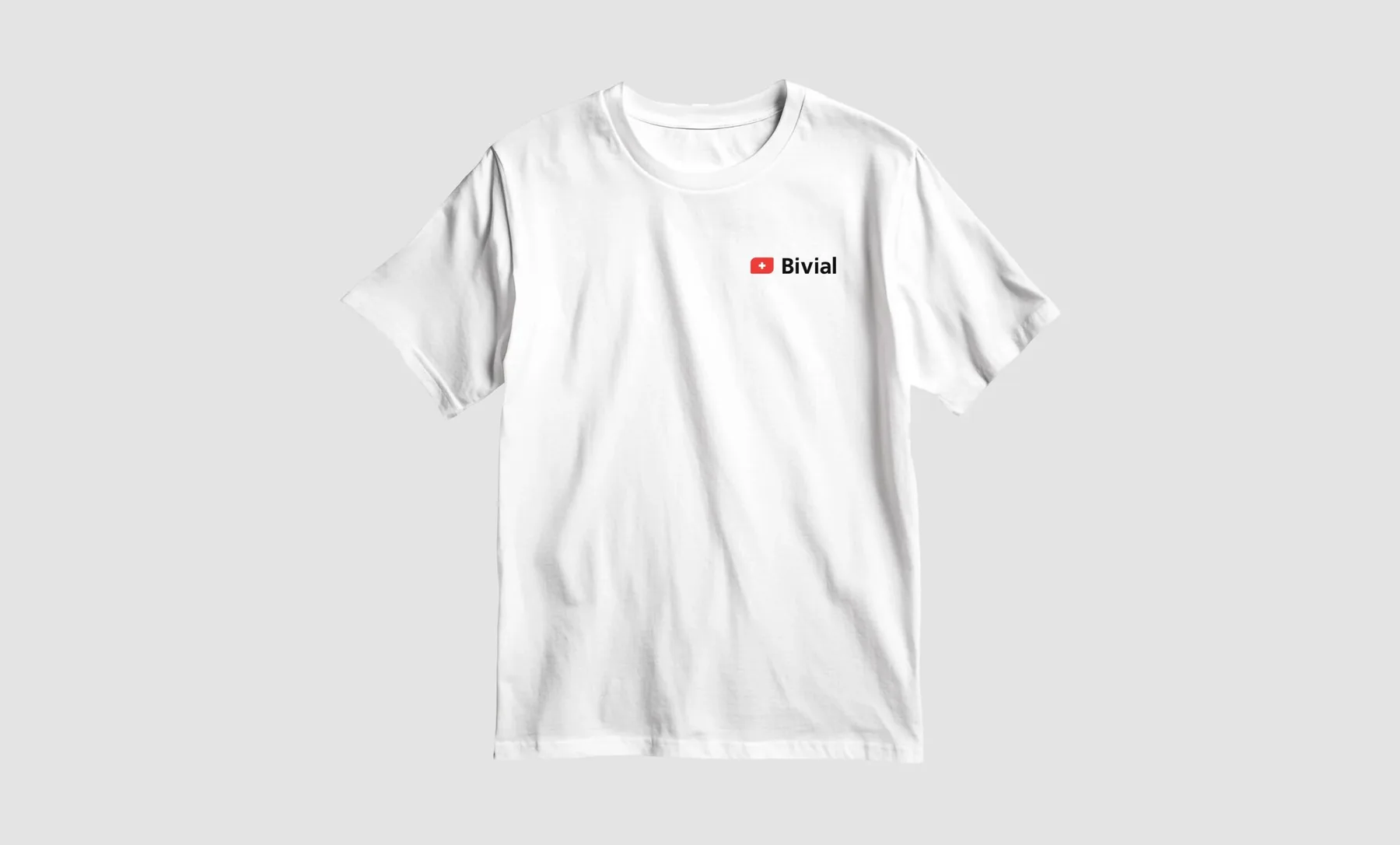
A coherent system across physical and digital touchpoints, grounded in usability, consistency and trust.