
Have you ever checked out a website on your laptop, then opened it again on your mobile or tablet, only to find you do not have the same experience?
This is what responsive design is all about; a website should respond according to a user’s device. A responsive design will display perfectly on all device sizes and orientations, maintaining all functionalities.
With responsive design, web developers hash out ‘flexible’ websites that adjust to fit the device. Mobile device web surfing is growing exponentially, so your website must function smoothly on all devices.
It is also important to remember that technology is always evolving, and screen sizes are constantly changing. If your website can adapt to any screen size at any time, then you are all set to go. The responsive design considers all these factors and optimises each user’s experience.
Unfortunately, many businesses in Cyprus are not updated with their websites, let alone responsive versions. This is where you can take advantage of your competitors to gain customers.
Google takes responsive website design very seriously, even creating a mobile version of their search where they favour websites that are responsive for mobiles. Here you can easily take advantage and rank higher and quicker with a responsive website.
How does it work?
Many website frameworks allow for easy mobile styling by folding elements one beneath the other. So, for example, when you have the main hero image only our desktop site followed by columns of 3 icons, imaging the icons will fold one beneath the other so that on mobile, instead of being next to each other and having three columns, you will have one column and each of the elements will be below the other.
Easy peasy. But it goes deeper than that. It can also be more than a flexible and responsive design. It can be a unique experience built purely for mobile viewers.
Putting aside all the developer tricks to get the perfect responsive design from the desktop version of your site, you can always take it one step further by designing with mobile in mind.
If your business has many visitors using mobile devices, then it’s time to consider mobile-first web design. This is as simple as it sounds, designing for mobile first and then expanding the experience to the web.
When you think about mobile-first when designing your new website, you will design the best possible experience for your mobile visitors and allow for a secondary web experience for larger screens.
With mobile phones becoming so advanced and web coding technologies allowing for animations, unique page loading transitions and vector style graphics, the sky’s the limit to what can be achieved for mobile or responsive web design.
Why is it so important to your business?
Just check the traffic to your website and you will be astonished at how many users access it through mobile devices. Remember that users will also be clicking on links in your emails or on your social media page, through their mobile device while on the go.
- Improves user experience: Responsive web design will create a smooth sailing experience
- Reduces bounce rate: Positive user experiences will keep them on your website for longer
- Caters to all habits of users: Don’t lose users that prefer to view websites via tablet or mobile
- Helps your social marketing: Many users will share web pages directly to social media from mobile
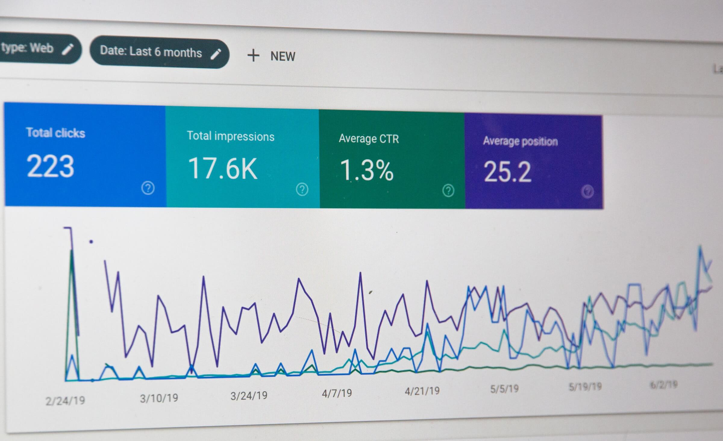
- Faster loading time: Google states that responsive web design is a great way to reduce load time and counts toward your Google search engine optimisation (SEO) efforts.
Quick check if your website is responsive.
The easiest way to check if your website is responsive and has a unique mobile experience that is user-friendly and easy to use is to jump on your mobile device and check.
You can also do this on your web browser, such as Chrome, to check different device sizes, such as tablets.
- Open your website on Google Chrome
Ctrl + shift + i
Ctrl + shift + m
View your page from a desktop, mobile or tablet perspective
The takeaway is that responsive web design automatically scales your pages to fit every device and screen size, ensuring that you maintain user engagement. Forget horizontal scrolling and zooming in to read text or see images; responsive web design adjusts your entire website accordingly.
Awove is here to create a consistent, yet tailored, experience across every device.
