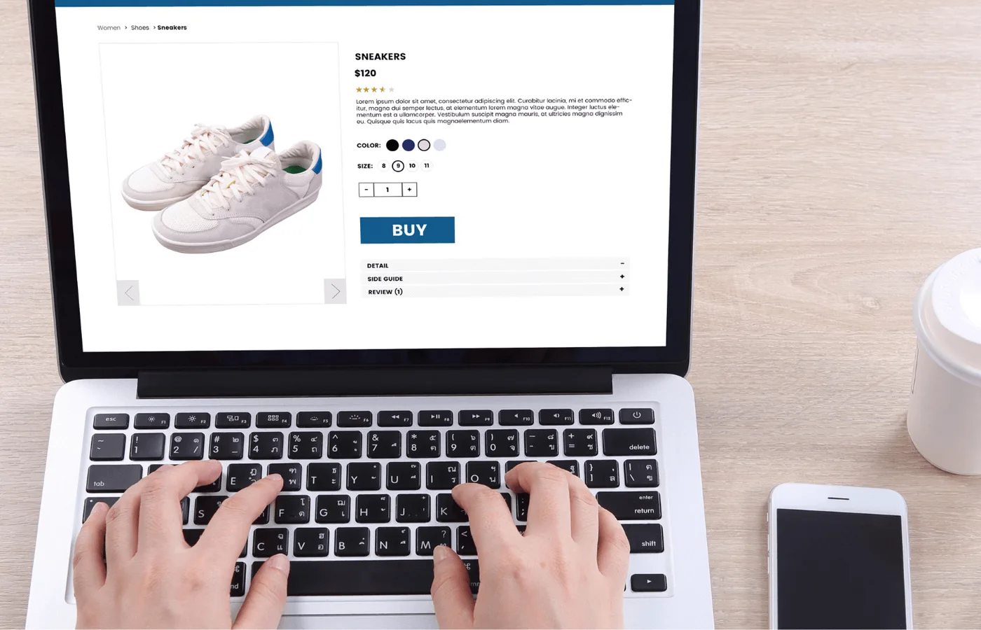
Lovely product photos. I’m interested. Now, will it fit, can you deliver it here, and what does the delivery cost?
Those are ordinary buying questions. If your shop makes them difficult to answer, the next animation isn’t the priority.
Follow the purchase beyond the product page. The less glamorous parts, right through to the order confirmation, need as much care as the opening image.
Start with the product information
What does someone need to know before they can choose confidently?
Show the relevant dimensions, materials, compatibility, variants and included items. Use photographs that reveal scale and detail, not only an attractive lifestyle scene. Explain differences between similar products instead of expecting customers to decode internal product names.
When someone changes a size or finish, make it clear which price, image and availability belong to that selection. A customer shouldn't have to reach the basket to discover that the version they chose is the one you cannot supply.
The precise information depends on the purchase. A jacket, replacement component and piece of furniture present different questions. Build the page around those questions rather than a generic list of marketing adjectives.
Help people narrow the range
Categories, search and filters should reflect how customers choose, not only how the warehouse organises stock.
A useful filter changes the decision. An endless collection of obscure attributes makes a catalogue look sophisticated while doing very little to help.
Preserve the visitor's selections when they open a product and come back. Make an empty result useful with a clear way to adjust the search. Check the same tasks on a phone, not just on the designer's large display.
Explain the costs and conditions early
Delivery charges, availability, payment options and returns can affect whether the order makes sense. Do not save all of them for the final screen.
For specialist or made-to-order products, explain what needs confirming and when the customer is committing. An honest lead time is more useful than a reassuring label nobody operationally supports.
You can create urgency by telling the truth about an actual constraint. Invented countdowns are not a substitute for a compelling product.
Handle unavailable products intelligently
Temporarily out of stock is not automatically a reason to delete a useful product page. Keep the information available, state the status clearly and provide a genuine alternative or notification option when appropriate. Google also advises against removing temporarily unavailable products from Search simply because they cannot currently be bought.1
Permanently discontinued products need a considered decision about replacements, existing links and what visitors still need. Do not apply one blunt rule to every stock change.
Make checkout forgiving
Ask for the information required for the transaction, not every detail that might interest the marketing department. Use clear labels, useful validation and errors that explain how to recover. W3C's form guidance addresses those basics directly.2
Test interrupted payment flows, duplicate button presses and failed transactions. Tell the customer what happened before asking them to try again. An unclear payment result leaves both sides wondering whether another click will produce another charge.
A correct screen is not enough if the order record or customer confirmation is wrong.
An account should provide a benefit, not serve as an unexplained obstacle before a simple purchase.
The order has to make sense at your end too
Inventory, order management, payments, delivery and customer support have to agree about what happened.
That is where complex commerce becomes a business-systems project as much as a storefront. A custom feature needs a clear operational owner and a way to handle exceptions.
For the brand, consistency continues beyond the checkout. The order email, packaging and response to a problem are part of the same promise as the homepage.
Measure the steps that matter with the permissions and tools appropriate to the business. Look at failed tasks and customer questions, not just traffic or the colour of the buy button.
Use the payment provider's test environment to follow an order all the way through. Choose a variant, change the quantity, make a mistake in the address and check the confirmation. Then ask the person responsible for fulfilment to work from the records they receive. Can they identify exactly what was ordered and where it should go?
Then check the live shop as well. The shop isn't finished just because the buy button goes somewhere.