Natalie Royer
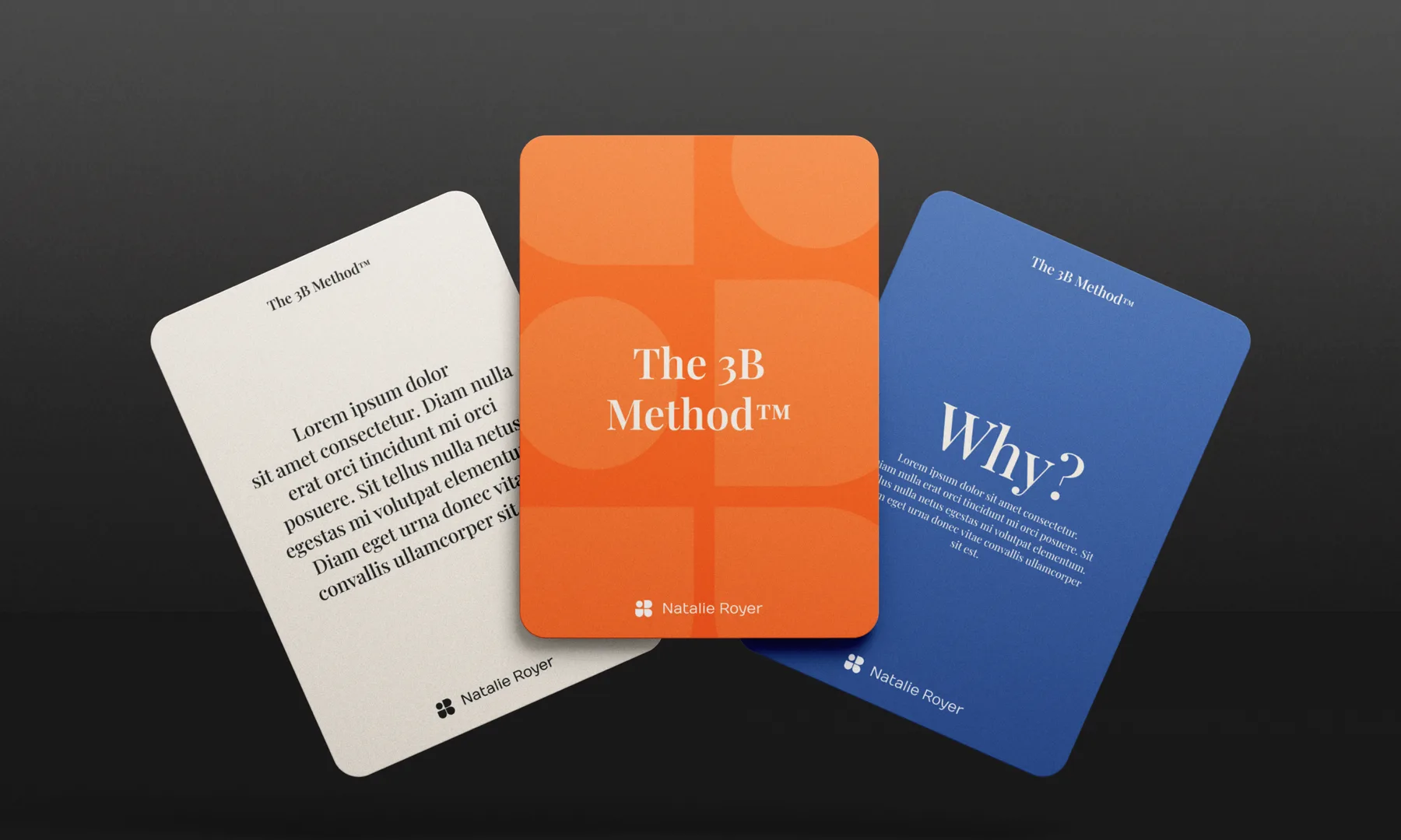
Brand identity for Natalie Royer - a coach, speaker, and founder of the 3B Method™.
The brand is grounded in self-return, emotional resilience, and personal transformation, expressed through warm, psychologically coded colors and a layered visual metaphor that speaks to wholeness and worth.
From burnout to belonging - a brand built for impact, healing, and homecoming.
Natalie Royer is not just a personal brand, she’s a movement. A speaker, coach, and visionary with a deeply human mission: to guide others home to themselves after burnout, disconnection, and the pressure to constantly perform. Our task was to capture that emotional weight and clarity in a brand identity that feels empowering, safe, and bold.
We started with deep brand discovery, uncovering the pillars of her work, the 3B Method™: Beneath → Breakthrough → Becoming. This journey became the brand's structural foundation. The logo itself is a visual metaphor, beginning as a pill (a choice to awaken), evolving into a cocoon, and eventually symbolising transformation, integration, and belonging.