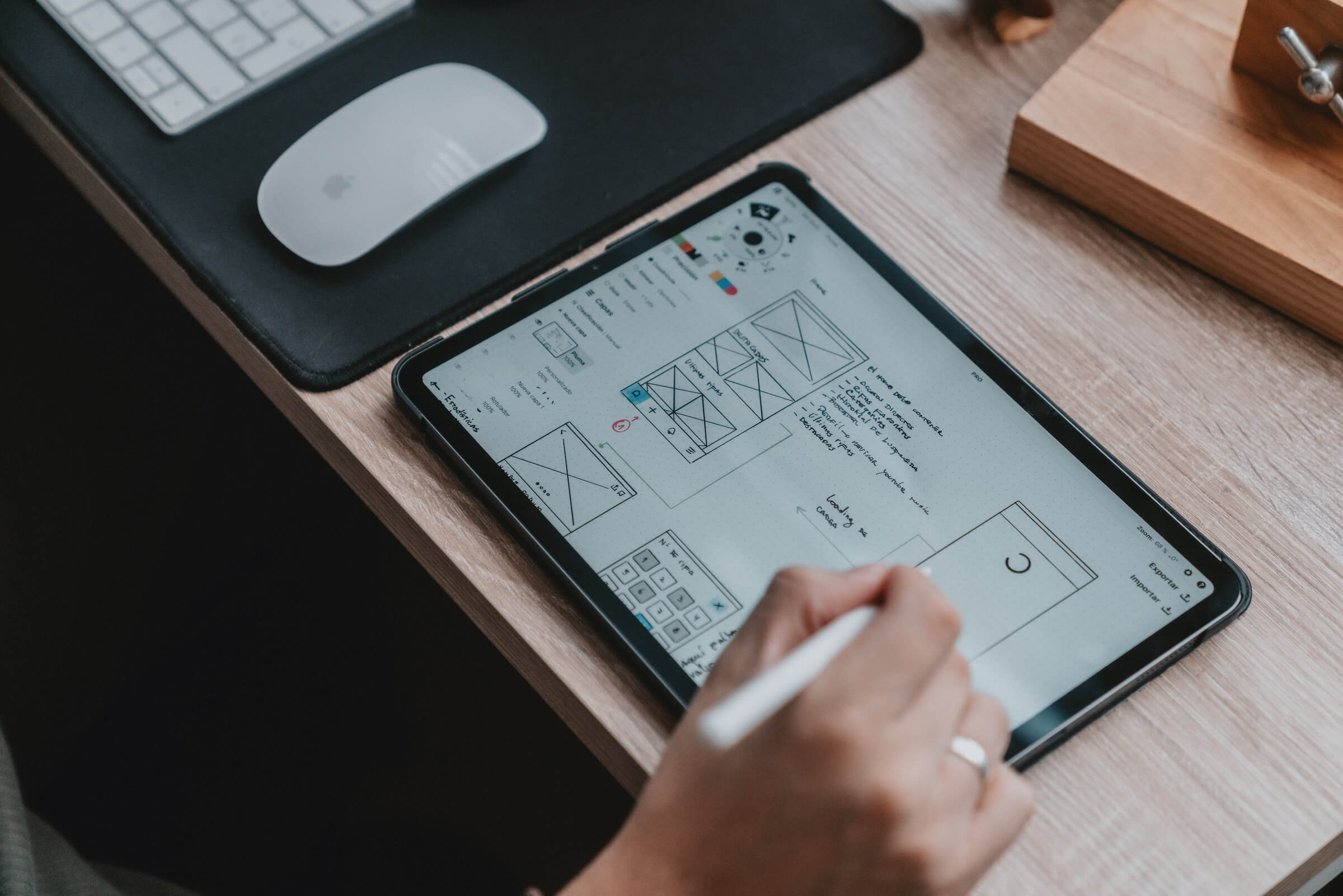
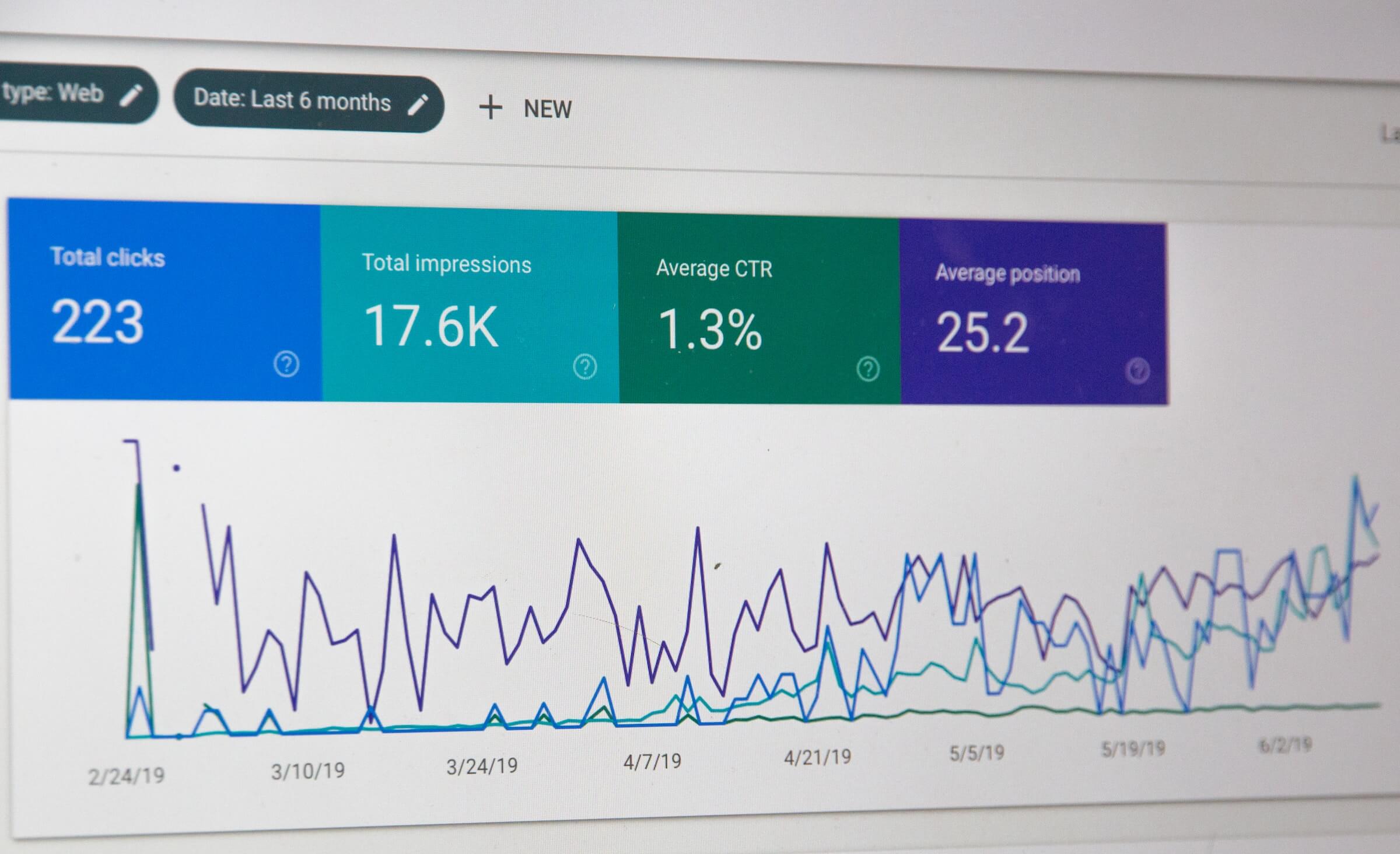
Im calling a few web design trends we can expect to see in 2016. This is by no means mind boggling and if you have any experience in web design the below trends solve UX (user experience) issues whilst catering for a mobile friendly environment. Which leads me to my first trend call.
Death to the side bar, death to tradition?
Although you have probably heard this for the past few years, the message is only going to get louder that responsive web design will continue to drive the design industry forward as devices get smarter faster and cheaper. This means that traditional layouts such as the golden rule of 2/3 1/3 and the good ol sidebar become irrelevant.
On desktops the sidebar is very useful, however; go a couple of screen sizes smaller and it becomes a white elephant that ends up needing to be dealt with.
The side bar will most likely become a thing of the past and we have seen this happening in 2015 with this trend continuing through to 2016 as more designers become creative with how to do without.
Logical mobile navigation.
This is something that I started implementing into designs.
Grab your phone and hold it as you normally would. You will most likely find that your thumb is perfectly poised to start the navigation process.
Taking this into consideration, in theory, your thumb should be able to allow you to navigate the site or app all within minimal stretch range without the need to change hands or hold the phone differently in order to stretch up to touch an icon top left or top right.
This can even be taken a step further by creating a circular menu or nav design where all items are hidden (even scrolled) within comfortable reach of your thumb. Imagine how streamlined the whole process can be if you simply have all nav within reach of your thumb? Flipped awesome.
Typography
Too be honest, this is most likely my number one recommendation this year. Everything else mentioned here are great, however; take typography seriously and here’s why:
Have you ever visited a website where all the elements on page made the content read easy? You seem to breeze through the written words and everything is comprehensible, reads well, flows well and something in the back of your mind says, “that was a good read”?
This is Typography. Get it right and your content pops. I would almost go as far as to say that 90% of the work is done around Typography. Font choice, line height, letter spacing and layouts, are what make content readable or not. this is also crucial as we all know by now that content is king and will stay this way.
A great resource to learn more about good Typography habits, fonts, and the like from what I would call the Holy Book of Typography check out practicaltypography.com.
Design for mobile content
Designing for mobile first or at least, designing so that you site works well on mobile is a given.
What is often forgotten, is designing for your content. In short, start off with your content, followed by designing or rather adding elements to compliment your content. Obviously, depending on your content or what the product is you are selling, this will determine what sort of elements or design to implement in order to accentuate your content.
If the purpose of your site is the written word, then elements on page and overall design atmosphere should be geared toward making your content pop. Same goes for eCommerce and or services you are selling. Drawing the reader’s attention away from the goal or purpose of the page is a no go. Similarly, distracting them with hard elements and too many focal points will not do your content any justice.
This trend lies inline with minimalist design. Less is more will help you maintain the balance between good design that supports or helps accentuate your content more ultimately leading to better engagement with your content.
Media rich websites.
The above example leads us to our next trend- media rich websites. Media being imagery, video, gifs, sounds and interactions. The whole point of a website regardless of what your content, product or service is; is to give the user a good experience in order to complete an action; again whatever that action may be.
This being said, if you have a website that focuses on travel, using strong imagery, video or even an interactive experience as seen in the example below, helps you sell the destinations and in turn your service.
Death to the Stock Photo.
Most of you know the brand above, but it is also a design trend that will be strong as more and more folk opt out of using stock images, going for a more personal or humanist touch using your own photography or that of the many cool sites out there.
Less bang more function?
Touched on this above, but it deserves its very own slot. Minimalist, less is more focused design will see a huge surge in popularity as more designers out there realise that the WOW BANG BANG is mostly a flop unless you have endless budgets and time to get it perfect.
Without going into too much detail, Ill refer to a quote when I first started screwing around with web design;
“Good design is one that when asked what a viewer thought of the website’s design they just visited, and the reply is “don’t remember”, you know you’ve nailed it.
The above is kind of an oxymoron, in the fact that branding says make a lasting first impression whilst design says less is more. However; how these two are married again leads us to an above point where content is king. If you design for your content and only to compliment your content, you have effectively done the best design job you possibly can.
A show is not always required especially when this comes at the cost of a user interacting with your content, product or service.
Hope you enjoyed- please share if you have any thoughts or comments to add.


One Response
Very pleasant read !! I Agree with many points… typography, Death to the Stock Photo… Basically I call for a less “marketed” design… more human… more close to us…