Im a big WordPress fan. I use it for everything, recommend it to everyone and I make my living from it. I’ve got a list of cool things I’d like to see WordPress implement / fix but that’s another post.
Today however; I am going to take a swipe at WordPress’ new default theme TwentySeventeen. It’s horrid. I have absolutely no idea how WordPress (a power house) haven’t managed to produce a decent default theme since TwentyEleven.
Whilst I personally support artistic expression – all art is beautiful, this particular theme was designed by an individual that works at WordPress. Im not sure if there were too many requests from the community and the end result is the best she could have done design wise based on these requests or if this is her artistic direction, but it’s almost as though TwentySeventeen is lagging by three years in design.
Whilst I will not claim to be the best designer out there, I certainly think the home page of TwentySeventeen is an outdated, half assed attempt at sectioning and almost overdone with the parallax scroll effects to the extent where it becomes cheesy.
I can guarantee you that there are top design agencies out there such as HelloMonday that would jump at an opportunity to design the default WordPress theme of the year for free. End result- modern, slick and kick ass- guaranteed.
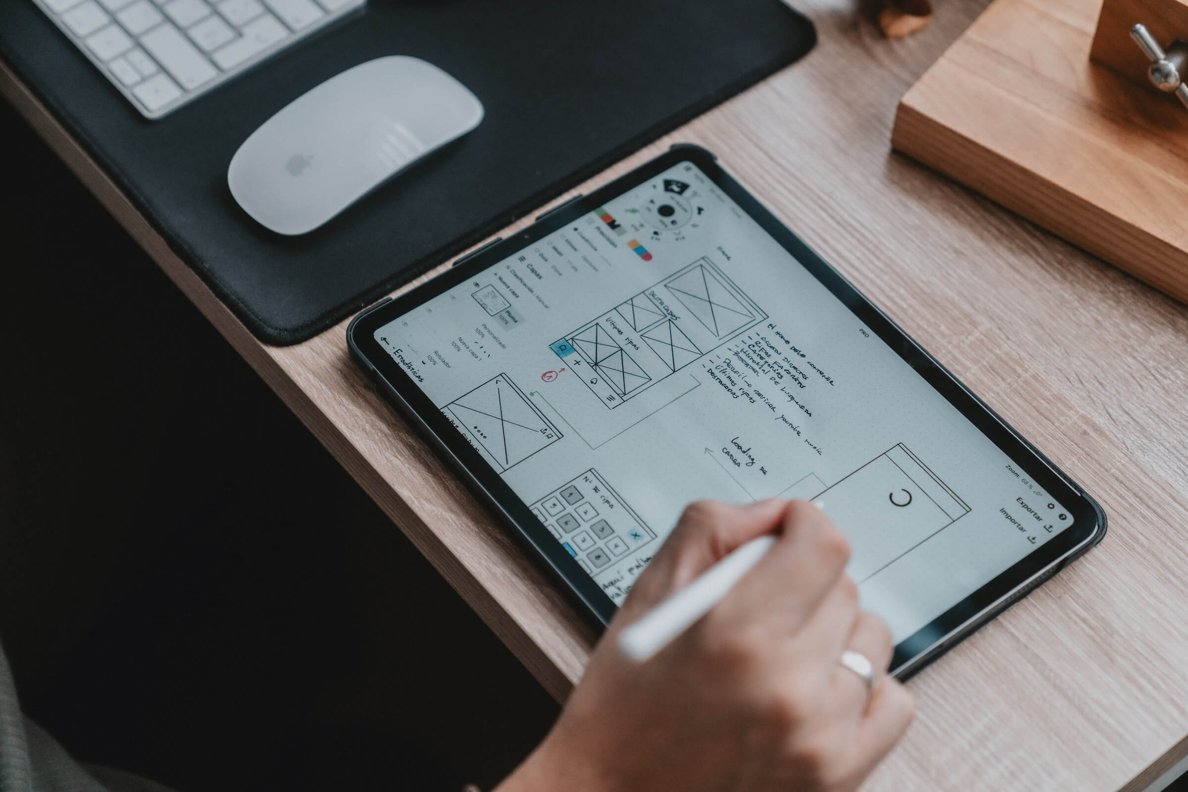
However, in the spirit of WordPress and open source; why not simply put up some initial wire frames, mockups and sketches to the WordPress community and let folk vote on a look or feel? I cannot be the only one sitting here looking at the current TwentySeventeen and feel it looks like it was done by a minor?
When you are as big as WordPress and have a community of excellent modern folk supporting, you must be the best. Your default theme should be the most up to date look, feel, UX and pretty much have the design industry left with their mouths open. There is no excuse.
Anyway, I apologize if the main designer ever happens to read this post as it’s never nice hearing criticism- its not personal.


