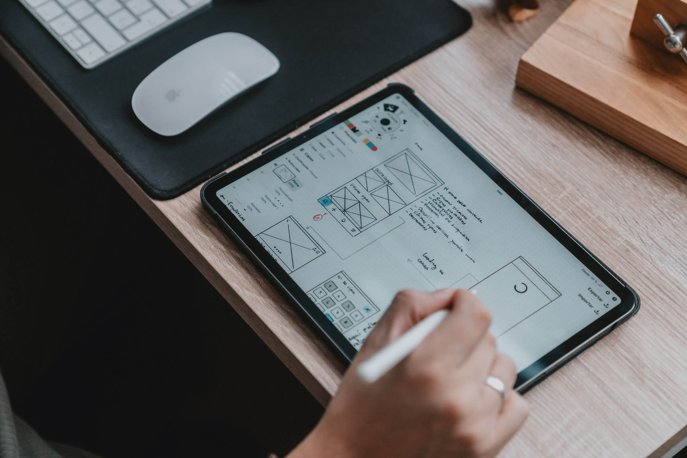
Ok, admittedly this is a topic that seems so obvious but can be extremely hard to implement. I mean, focal point/s is one of the first things you learn when designing, how hard can it be, right?
After many years of knocking out various design projects, I still find this one of the hardest principles to implement into my design. Today’s designers have that many call to actions instructions from signup to this, buy that, like, share and join. It can often overcrowd a page / design and let things get pretty messy.
Without digging your brain’s with obvious yet useless explanations into the topic…
What is it?
It’s the thing / object / whatever you want the visitor to notice first (of importance). This can be a button or sentence on a webpage or that one element in a photo where you want everything to begin and end.
Why?
Because we are weird and we can be controlled. Oh, look, its a big red button.
How?
No particular magic formula. Every “big name” tutorial out there gives shitty examples and spin’s the same lines from different angles (to make 500+ words), that make no sense.
I’m still trying to figure it out but I’ll never forget seeing the below chart that sort of helped it make sense in my mind. Less is more is most likely the simplest way to achieve that perfect focal point on the page. Remember to always ask yourself, what is the purpose of this web, landing page or banner… If it has no purpose remove it. This helps clean up a page to accentuate the focal point even more.
The Simple Illustration to Explain it…
Make your own, it’s rather entertaining but helps ingrain it into your psyche.