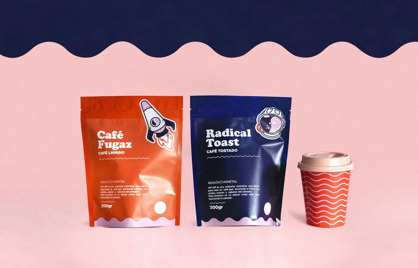
You can spend a lot of time making a package look wonderful in a mockup. Then print it at its actual size and discover that the product name is hard to read and the label doesn’t fit the information.
That’s an expensive way to find out the design isn’t finished.
I’d look at how someone finds, chooses, opens and uses the product as well as how it photographs. The box has work to do after the presentation.
Make the product understandable
Start with the buying situation. Is this being seen on a crowded shelf, in a small online image or as part of a specialist purchasing process?
The front of the pack cannot explain everything. Decide what needs to be clear first: the product, the variant, an important benefit or the brand people are looking for.
Information hierarchy is especially important when the range expands. Customers should not have to become familiar with your internal naming system to distinguish the ordinary version from the concentrated one.
Give the brand a recognisable presence
Colour, typography, imagery, shape and material can all contribute to the identity. Their job is to express this business in its category, not to obey a chart declaring that one colour means trust and another means wealth.
Look at the competitors, but do not simply copy the category and add a different logo. Decide where familiarity helps someone understand the product and where a distinctive decision can make it recognisable.
Then test that identity across the whole range. A design that works for one beautifully proportioned mockup may become awkward on the smallest size or a label filled with actual information.
Treat the back as part of the design
Directions, quantities, ingredients or specifications need to be usable. Required product information is not an inconvenient layer somebody else can paste on after the creative work is approved.
Bring the appropriate product and regulatory expertise into the process before production. The design needs to accommodate the correct information, not compress it until nobody wants to read it.
Check actual type size, contrast, line breaks and the conditions under which the pack will be used. An instruction hidden across a fold or a pale label on a reflective surface can look perfectly respectable in flat artwork. Put the information where somebody can actually find and read it.
Material is a design decision with consequences
A finish that feels expensive in a meeting may be difficult to recycle, vulnerable in transport or impractical for the intended production volume.
Discuss those trade-offs with the supplier. Ask for samples. Check what the ink, substrate and finishing process actually do together.
Be precise about environmental claims rather than use a leaf motif to imply qualities the materials do not support.
Get the material in your hands before approving the finish. The way something looks on a screen won't tell you how it scuffs, folds or feels. Try opening and closing it too. The person who bought the product shouldn't need to destroy the instructions to get inside the box.
See it at its real size
Review a physical mockup wherever practical. Put it beside related products. Look at it as an online thumbnail. Check the barcode and production artwork through the appropriate supplier process. Proof the actual file going to print, not the earlier version everyone admired.
Packaging can create interest and make the product easier to evaluate. The product and experience then need to support the expectation.
At Awove, we approach it as an application of the brand, not an isolated styling exercise. The pack should help the right person understand what they are picking up and recognise who made it.
Before approving the print file, put the smallest version in front of someone who hasn't been designing it. Ask them to identify the variant, find the directions and open it. Watch where they hesitate. A beautiful mockup can persuade the team that the work is finished; the physical pack gets the final say.